Editors Choice
Menu
Image Generate
Anniversary Wishes Professionally
Open the prompt, copy it, and reuse it in your own workflow.
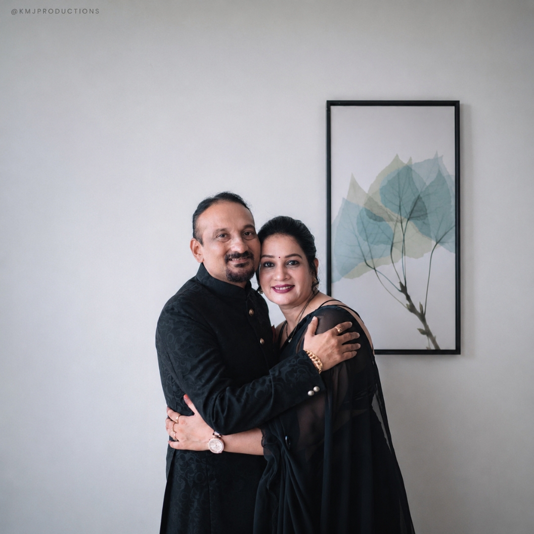
Before
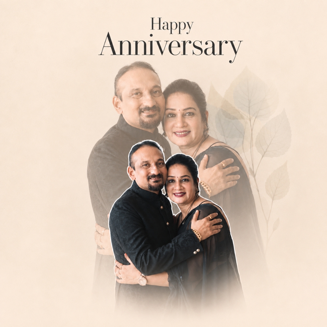
After
Full Prompt
INPUT:
Use the uploaded image(s) provided by the user as the ONLY source material for the people/subjects. The uploaded image(s) are the identity and appearance reference.
TASK:
Transform the uploaded photo(s) into a premium, elegant, soft editorial greeting-card collage inspired by the provided reference style.
IMPORTANT — IDENTITY PRESERVATION:
Preserve every person's identity with maximum fidelity. The original face must remain exactly the same person.
DO NOT:
- Change facial identity
- Redesign or regenerate the face
- Alter facial structure
- Change eye shape, eye position, eyebrows, nose, lips, teeth, cheeks, ears, jawline, chin, forehead or facial proportions
- Change hairstyle or hairline
- Change body shape, height, proportions or posture
- Change clothing design, clothing color, fabric, patterns or accessories
- Change jewelry, glasses or other personal accessories
- Change the person's age
- Beautify or stylize the person
- Make the person look like another individual
- Replace the original person with an AI-generated lookalike
- Create artificial skin texture or plastic-looking skin
The result must look like the ORIGINAL REAL PERSON photographed naturally.
SKIN:
Only apply a very subtle professional exposure/skin-tone refinement:
slightly brighter, cleaner and more luminous skin while retaining the person's natural original complexion, undertones, pores, texture and facial characteristics.
The skin must NOT become unnaturally pale, white, porcelain, overly smooth or airbrushed.
Keep realistic skin texture and natural facial detail.
The change should be extremely subtle — approximately a natural photographic brightness correction rather than a beauty filter.
REALISM:
100% photorealistic.
Natural human skin.
Natural hair.
Natural clothing texture.
Natural facial detail.
Real photographic appearance.
No illustration.
No cartoon.
No 3D rendering.
No painting.
No artificial AI face.
No excessive HDR.
No plastic skin.
No beauty-filter appearance.
REFERENCE STYLE:
Recreate ONLY the DESIGN, GRAPHIC TREATMENT, LAYOUT LANGUAGE and FINISHING STYLE of the supplied reference.
Do NOT copy the identity, face, body, clothing or specific people from the reference.
COMPOSITION:
Create a vertical premium greeting-card composition.
Use:
- A warm soft beige / ivory background
- Minimal elegant editorial design
- Large centered serif typography at the top
- Generous negative space around the typography
- Main large portrait layer positioned below the typography
- A smaller foreground portrait/cutout layered over the lower-middle portion
- Multiple portrait layers when multiple uploaded photos are supplied
- Clean overlapping photographic cutouts
- Thin soft white/off-white outline around the foreground portrait layer
- Subtle depth created by overlapping the portrait layers
- Soft faded photographic treatment toward the bottom
- Gentle cream/white atmospheric fade around the lower edges
- Very subtle warm pastel toning
- Soft, refined, premium wedding/anniversary-card aesthetic
PORTRAIT LAYERING:
If ONE photo is uploaded:
Create a tasteful layered collage using the same person/photo without inventing a new person.
If MULTIPLE photos are uploaded:
Use the uploaded photos as separate portrait layers.
Preserve each person's original identity and appearance.
Arrange the photos naturally into a cohesive collage.
The largest/background portrait should be softly faded and occupy most of the middle/lower composition.
The main foreground portrait should be smaller, positioned approximately in the lower-middle area, and separated from the background using a thin soft white outline.
Do not distort faces or bodies to fit the layout.
Crop only where necessary for composition while preserving recognizable facial and body proportions.
REFERENCE-LIKE GRAPHIC EFFECT:
Create a soft photographic collage effect:
- Background portrait: low-opacity / faded appearance
- Foreground portrait: clearer and slightly more prominent
- Thin white/off-white cutout border around foreground subject
- Soft cream glow
- Gentle atmospheric fade
- Low-to-medium contrast
- Warm neutral highlights
- Slightly muted pastel colors
- Soft film-like tonal response
- Smooth transitions between portrait layers
- Clean professional commercial print finish
COLOR:
Keep the ORIGINAL COLORS OF THE PEOPLE'S CLOTHING EXACTLY AS THEY APPEAR IN THE UPLOADED PHOTO.
Do not recolor clothing.
Do not introduce new dominant colors.
Apply only the overall soft warm editorial finishing:
warm ivory background,
muted pastel tonality,
soft cream highlights,
slightly faded shadows,
natural skin tones,
subtle warm photographic finish.
TYPOGRAPHY:
Recreate the typography treatment from the reference.
Use an elegant high-contrast luxury serif typeface similar to:
Didot / Bodoni / modern editorial serif.
Typography should be:
- Thin-to-medium strokes
- High contrast between thick and thin strokes
- Elegant
- Minimal
- Sophisticated
- Dark charcoal/black
- Center aligned
TEXT POSITION:
Keep the text in the SAME GENERAL POSITION AND HIERARCHY as the reference:
Top center:
"Happy"
Below it, substantially larger:
"Anniversary"
Maintain:
- Same three-line hierarchy
- Same centered alignment
- Similar vertical spacing
- Similar relative font sizes
- Similar negative space
- Similar distance from the top edge
- Similar relationship between typography and portraits
If the user provides different text, replace only the wording while maintaining the SAME typography style, hierarchy, positioning, spacing and proportions.
Do not place text over important facial features.
LAYOUT PROPORTIONS:
Maintain the reference's vertical poster/card composition.
Approximate visual structure:
Top 17–20%:
Typography and clean negative space.
Middle 25–65%:
Large faded portrait/background image.
Lower-middle 45–80%:
Smaller crisp foreground portrait overlapping the background portrait.
Bottom 70–100%:
Soft white/cream fade with the portrait gradually disappearing into the background.
The exact placement should remain visually faithful to the reference while adapting intelligently to the uploaded image(s).
LIGHTING & FINISH:
Do not invent a new lighting setup.
Preserve the original photograph's lighting.
Only apply subtle global finishing:
- gentle highlight rolloff
- soft contrast
- slightly lifted shadows
- warm neutral balance
- subtle film softness
- clean editorial print finish
The photograph must still look like a real photograph.
FINAL QUALITY:
Premium commercial greeting-card photography.
Elegant editorial design.
Photorealistic.
Natural.
High detail.
Clean edges.
Accurate faces.
Accurate clothing colors.
Accurate body proportions.
Natural skin texture.
No AI-looking faces.
ABSOLUTE PRIORITY ORDER:
1. Preserve identity and facial structure.
2. Preserve body proportions and clothing.
3. Preserve original clothing colors.
4. Preserve natural photographic realism.
5. Recreate the reference's collage layout and typography treatment.
6. Apply the soft warm editorial color finish.
7. Add subtle skin brightness only without changing natural complexion.
The reference controls STYLE and DESIGN.
The uploaded image controls IDENTITY and APPEARANCE.
Never allow the reference image to override the identity or appearance of the uploaded person.
New Color Grading Tool
Comming Soon